bhoost.
Smarter hotel pricing. Simpler booking.
A hospitality MVP connecting pricing intelligence, hotel operations and guest booking — developed from product concept and UX to frontend implementation.
From hotel decisions to a guest’s stay.
Bhoost brought hotel operations and direct booking into one connected product, with a focused interface for each side of the experience.
Authentic Figma source screens. Property details and figures are demo content; guest contact information has been removed.
Hotel demand shifts. Pricing and booking still need to feel clear.
Room prices can reflect season, demand, availability, local events, competitor rates, rate plans and channel conditions. Operators need to understand those inputs; guests need a straightforward way to choose a stay.
Bhoost set out to make the business context legible inside the hotel workspace, then guide guests through a separate, focused booking journey.
Hotel operations
- 01Property setup
- 02Competitor selection
- 03Demand & rate review
- 04Availability & pricing
- 05Reservations
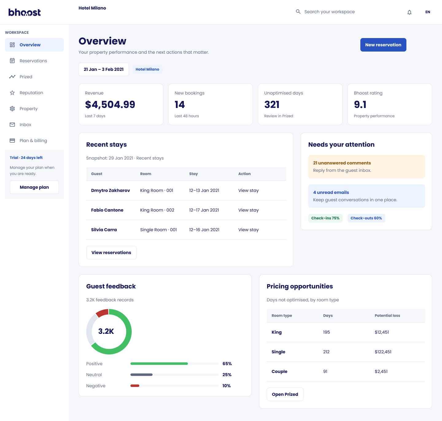 Hotel workspace overview
 One productHotel context
meets guest choiceConceptual product relationship · no claim of live synchronization
Guest booking
- 01Search dates & guests
- 02Available rooms
- 03Room selection
- 04Guest & payment details
- 05Confirmation
Guest booking room selectionFrom a market signal to a manageable decision.
The operator’s workflow moves between property context, competitor selection, room-rate decisions and day-to-day reservations. The diagram describes product navigation, not backend architecture.
Turn market signals into pricing decisions.
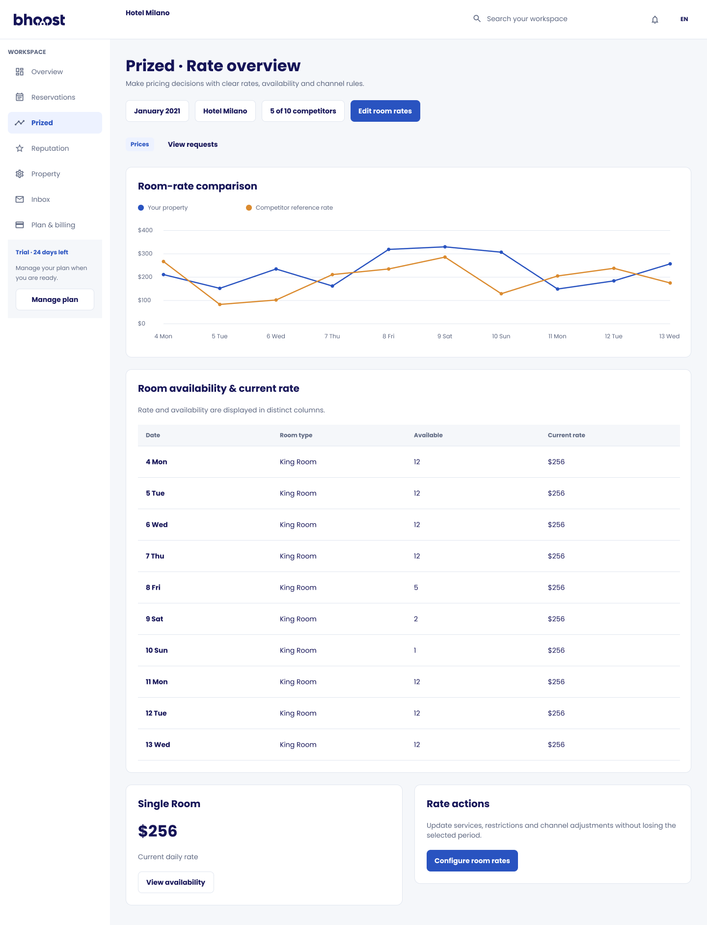
Prized brings a property’s rates alongside competitor references and daily availability. The interface explores comparative pricing, demand signals, suggested prices, event adjustments and room-specific decisions, with manual review and confirmation.
Compare the period. Review the rate.
Local event marker: the event adds context for operator review; it does not imply an automatic price change.
Conceptual, illustrative relationships only. No historical rate values or business outcomes are represented.
From signals to a confirmed change
The interface supports review; the operator remains in control.
reviews
Conceptual UX flow based on the archived screens — not a reconstruction of the pricing algorithm.
Authentic design screens connected to the decisions above.
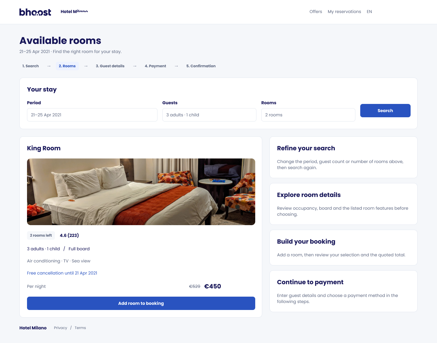
From available rooms to a confirmed stay.
The booking journey keeps search, room choice, guest details and payment within one continuous experience. The diagram makes the availability decision explicit.
- 01SearchDates & guests
- 02ResultsAvailable rooms
- Room
available?Yes - No · revise searchChange dates or guests, then search again↶ Search again
- 03SelectChoose a room
- 04DetailsGuest information
- 05PaymentReview method
- 06ConfirmReservation
- 07CompleteConfirmation
The availability branch is a conceptual recovery path for the booking journey; it does not imply a verified historical error state.
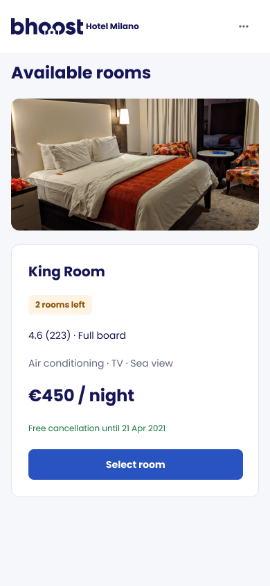
The same journey, shaped for a smaller screen.
The original mobile frames are designed at 390px. Search, room selection, payment and confirmation retain their hierarchy without shrinking the desktop layout.
Archived explorations beside the structured UI 2.0 work.
The archive includes different interface variants. They are shown together; their exact chronology is not established here.
Designing the experience was only part of the work.
My contribution crossed product definition, experience design, reusable UI foundations and frontend implementation. The Figma archive is the primary visual record; source repositories are no longer available.
- 01
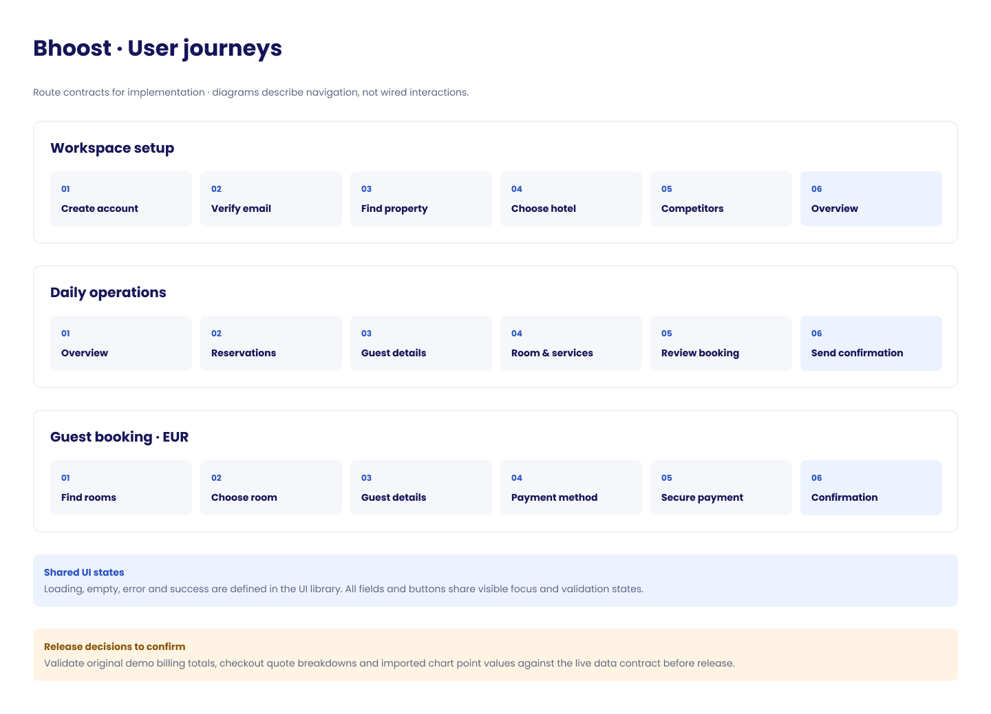 Documented user journeys
Product concept
Business problem, objectives and MVP scope
- 02Journey map
UX architecture
Information architecture and business workflows
- 03Prized rate overview
UI & interaction design
Dashboard, pricing and booking experiences
- 04
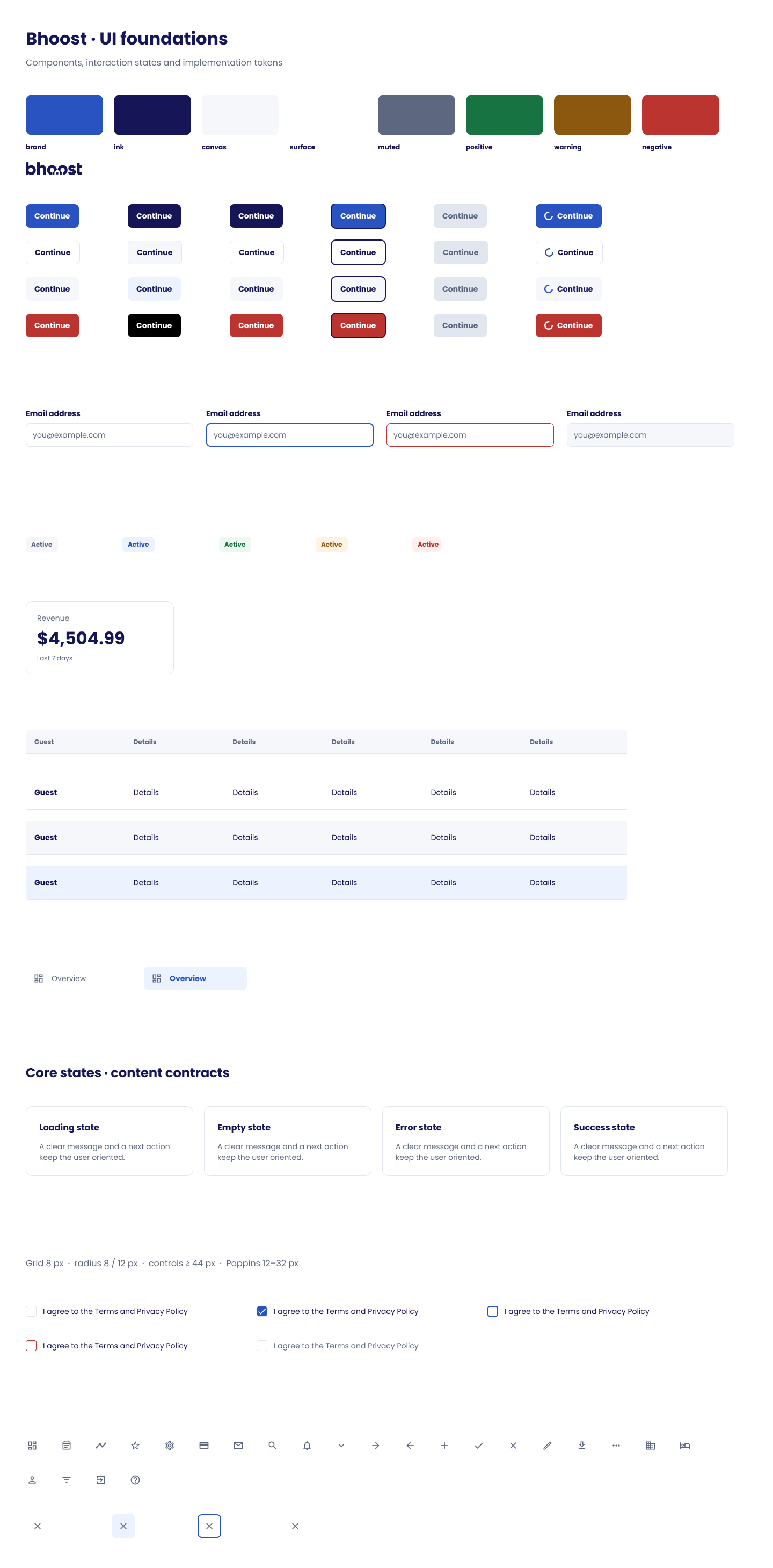 UI foundations
Reusable components, states and responsive rules
- 05
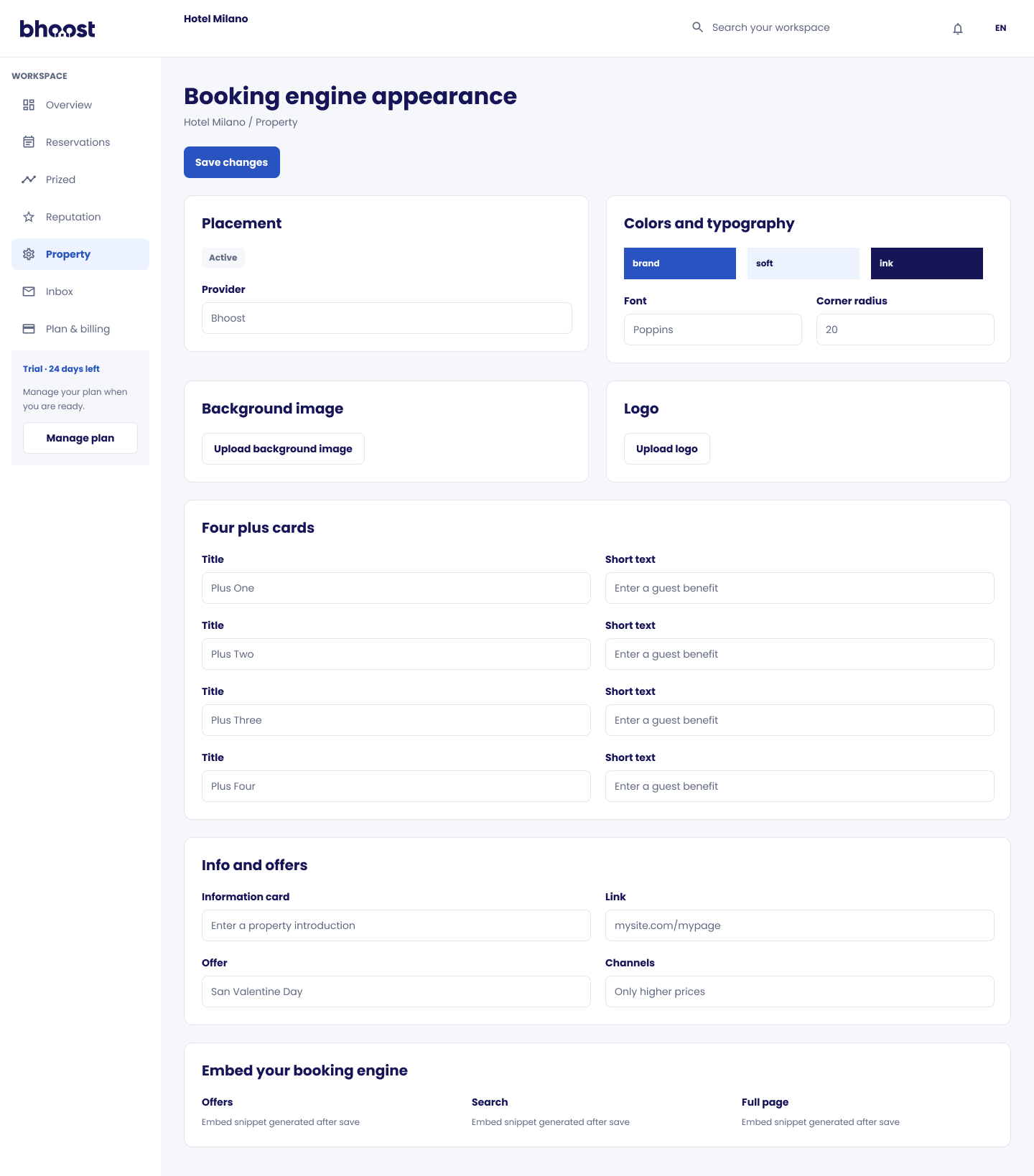 Booking interface
Frontend implementation
Interactive screens and user-facing states
Three routes through one product.
Sequence names follow the archived journey map. These are route contracts, not a claim that every state is wired to another in production.
Workspace setup
- 01Create account
- 02Verify email
- 03Find property
- 04Choose hotel
- 05Competitors
- 06Overview
Daily operations
- 01Overview
- 02Reservations
- 03Guest details
- 04Room & services
- 05Review booking
- 06Send confirmation
Guest booking
- 01Find rooms
- 02Choose room
- 03Guest details
- 04Payment method
- 05Secure payment
- 06Confirmation
View original Figma journey map
A lightweight system for operational clarity.
The archived UI foundation documents Poppins, an 8px spacing grid and 8px / 12px corner-radius conventions. Controls are designed around a minimum 44px interaction target.
Tables, dashboard patterns, buttons, form states and surface treatments form a reusable starting point for an MVP—not a claim of a full enterprise design system.
Build clarity into the connection between business logic and UX.
The outcome was an MVP spanning pricing intelligence, hotel workflows and guest booking experiences—supported by reusable interface foundations and responsive booking flows.
Building Bhoost reinforced a principle I still apply today: complex products need more than good interfaces. They need clear logic, coherent flows and implementation decisions that keep the experience connected.
I work across product definition, interface design and frontend implementation.
Yliway
Professional growth ecosystem